Re-design of a tourism experience site

Role:
Senior UX Designer
Duration:
9 Months
Responsibilities:
UX design, testing, prototyping, data driven design
The challenge
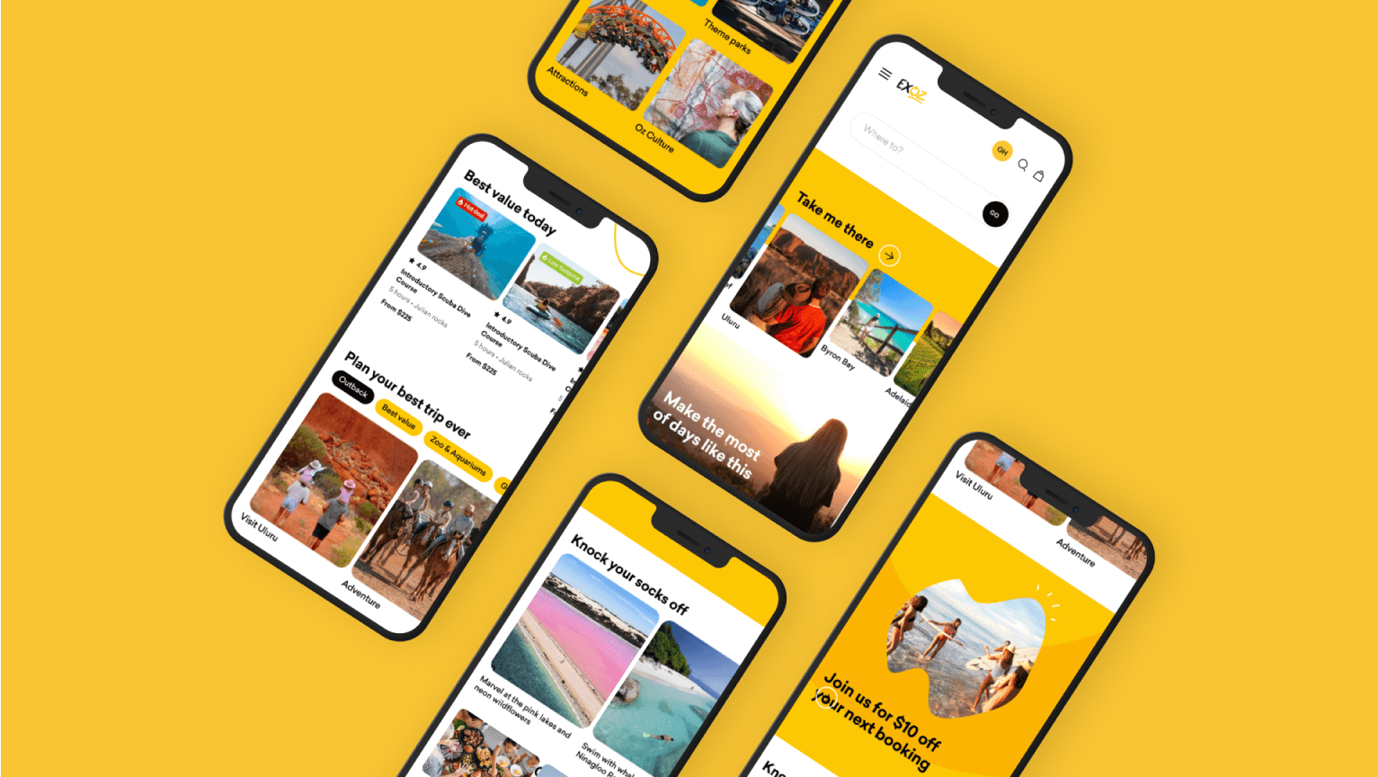
Experience Oz is an experience voucher e-commerce site. We were tasked with re-designing & developing their entire site & experience. They wanted to deliver a new refreshed feeling that excites the everyday Australian to experience what this country truly has to offer.
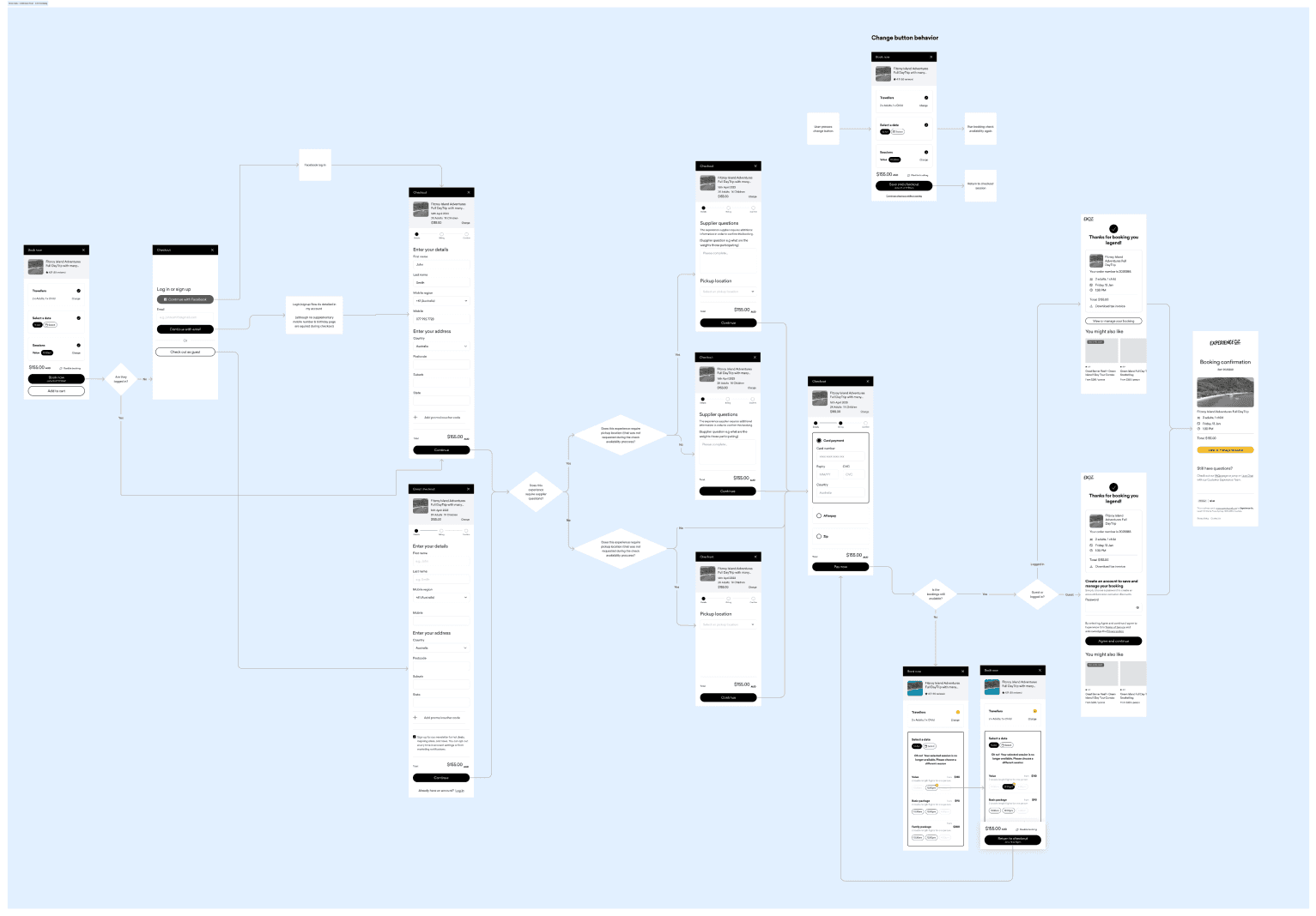
As lead UX designer on the project, I developed wireframes & flows that would upgrade the currently jarring experience into something far more seamless. Some of the key complexities came during the booking & checkout flows. Since the site had to interface with vendors with their own booking systems a vast number of issues & limitations had to be worked through.

Product listing page order optimisation
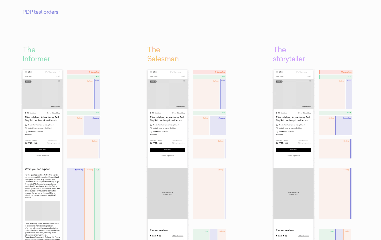
The product listing page displays the experiences in all their glory. However, this comes with one major issue. It is challenging how to prioritise the hierarchy of information. It is impossible on one screen to display large beautiful imagery, all the pricing information, available sessions, day itinerary, reviews & more. So a prioritisation process had to happen. I developed a method of understanding and visualising the information priority. I created four colour-coded categories: Selling, trust building, informing & cross-selling. I then assigned each component on the page a proportional spread of those categories.By doing this it made it possible to take a step back and get a clearer understanding of what the page was prioritising. From this, I developed three different layouts.1. The informer: This layout prioritises information such as schedules, participant requirements and what is included.2. The salesman: This is the hard sell, money and booking upfront with more detail further down the page.3. The storyteller: This is a bit of both, alternating more informational and more sales-heavy componentsFrom this, we were able to utilise these layouts to develop an A/B test plan. My theory was that experiences such as day tours would benefit from the informer. Whereas I believed that products such as theme park tickets would work better with the salesman. These interfaces are being tested and the results will be collated after 12 months.

Outcome
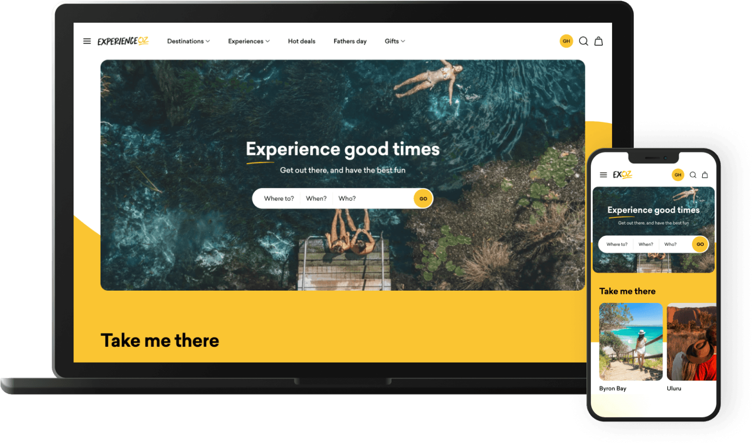
I designed the wireframes & flows, then worked in collaboration with a UI designer to turn them into dev-ready annotated designs. You can view the live site at www.experienceoz.com.au
